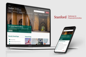
Fingate website has a user-friendly redesign
Updated navigation and search ensure quick access to vital information related to financial activities, and feedback mechanisms drive continuous improvement.
Have you visited the new Gateway to Financial Activities (Fingate) website managed by Financial Management Services? Fingate supports the Stanford community, visitors and those who do business with the university in understanding the university’s financial ecosystem.
Relaunched in September 2020 after a 20-month redesign and implementation process, Fingate now features a clean, modern look and user-friendly search and navigation built on the Drupal content management system.
A user-centered redesign
Fingate was created to help staff, faculty, students and suppliers quickly find information to perform financial activities efficiently, correctly, and within policy. But the 13-year-old site was no longer meeting the needs of its users and long overdue for a refresh.
Throughout the discovery and implementation phases, the Fingate Redesign team prioritized improving the user experience. To gather feedback and test the new design, the team conducted five user studies with 60 participants representing 17 business units across campus. The goals of the redesign were to improve navigation and search capability and modernize the site.
Faster access to vital information
The new site organizes information into easy-to-understand activities and topics that help users see the big picture of financial management at Stanford. Users have commented that the new site is “significantly better than the old site,” is “very organized,” and features “much easier” navigation.
By restructuring the website’s information architecture, the Fingate team has made it easier for users to “look” for what they are seeking by using the informative site navigation rather than the search function. As a result, use of the site’s search function during visits has decreased 98% post-launch.
Surveys conducted by the Fingate team before and after the relaunch showed a 19% increase in positive sentiment about finding information on Fingate. Before the redesign, over half the users surveyed found it time-consuming to find the information they sought.
Monitoring, feedback, and continuous improvement
Fingate has averaged 1,400 users and 5,000 page views per day since its relaunch. A key focus since launch has been closely monitoring the user experience and responding to feedback. The team uses analytics to track and report website traffic and heatmaps to understand how users are navigating the site. Users can report content issues or provide content feedback directly on the site by clicking a link at the bottom of any page.
The redesign team has defined a robust set of Key Performance Indicators (KPIs) and measurement tools to drive continuous improvement and achieve the website’s goals of ease of use, usability, appearance, comprehension and credibility. There have already been several enhancements to site appearance and usability since the September launch that have been driven by user feedback.
What’s next? Improvement plans include additional opportunities to gather feedback from users about their Fingate experience, such as Fingate polls and the FMS Client Satisfaction Survey planned for fall 2021. Stay tuned, and for now, the redesign team hopes you enjoy the new site and thanks you for your continued partnership and feedback going forward.
